Thursday, September 24, 2009

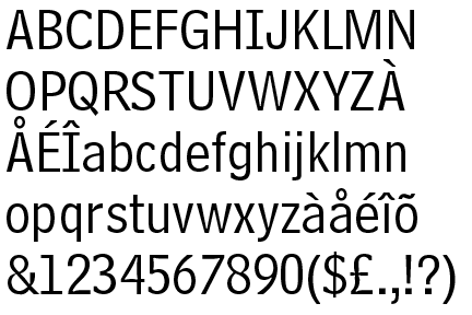
Max Miedinger

Other fonts:
I always really enjoy using Helvetica because you know, some people say they use a different typeface because it gives a different feeling. I really enjoy making Helvetica speak in different ways. It’s been around for fifty years, coming up, and it’s just as fresh as it was. Obviously, it wasn’t intended to be this cool thing, but it’s just a beautiful font.” -Michael C. Place
For more Love/Hate relationships with Helvetica, please visit this website:
http://nubbytwiglet.com/blog/2007/10/31/helvetica-a-love-hate-relationship/


The History of Helvetica

The history of Helvetica

Think of the 60’s era and its advertising. What comes to mind? Style? Slick designs? Clean lines? That’s due in large part to Max Miedinger and his Helvetica font design. Even today, this is one of the world’s most popular fonts.

The sans serif style font was developed in 1957 by Max Miedinger. With its clean lines and good looks, it took the world by storm. But popularity has its downside. Due to widespread use, Miedinger’s font grew into an anonymous, almost generic-looking font. Because it was embraced and used so often, it became the norm. In fact, the Helvetica font ended up being the default font choice almost from its inception. And when laser printers and desktop publishing software took off, Helvetica had a firm foundation as the sans serif font of choice.

The term Helvetica means “Swiss” which is appropriate because the Helvetica type face uses the Swiss style of graphic design which relies heavily on sans serif styling and a preference for photography over illustrations. Strict grid systems are another hallmark of the iconic Swiss style graphics which rose to popularity in the fifties through early seventies.

The Helvetica Font quickly rose to the top and became emblematic of the Swiss style. The Swiss design movement was sweeping the graphic world at the time with their theories of objective communication of ideas over artistic expression. Graphic designers loved the bold new look and clean lines and found it hard to resist. Laser printers and desktop publishing software developers chose Helvetica as their default font and sealed its fate as the iconic font that it is.

The popularity of this font couldn’t last forever. In fact many who once embraced it came to shun it due in large part to its popularity and newfound stature as the default choice for laser printers and desktop publishing applications. Such is life on the cutting edge.

But the demise of the Helvetica typeface isn’t nearly in anyone’s sights. Because of its wide availability, typesetters and printers continue to use it, as do designers who appreciate the reason behind its popularity, and users who want a clean, workhorse font that will do their publications justice.

Helvetica

abcdefghijklmnopqrstuvwxyz

ABCDEFGHIJKLMNOPQRSTUVWXYZ

01923456789

@!*&? {}


Helvetica was first designed in 1957 by Max Miedinger. The name is derived from Helvetia, the Latin name for Switzerland. New weights were added by the Stempel foundry. Later, Merganthaler Linotype added new versions.


Max Miedinger (December 24, 1910 in Zurich, Switzerland - March 8, 1980, Zurich, Switzerland) was a Swiss typeface designer. He was famous for creating Helvetica in 1957. Marketed as a symbol of cutting-edge Swiss technology, Helvetica went global at once.[1]

Between 1926 and 1930, Max was trained as a typesetter in Zurich, after which he attended evening classes at the Kunstgewerbeschule in Zurich.

Later, he became a typographer for Globus department store's advertising studio in Zurich, and became a customer counselor and typeface sales representative for the Haas’sche Schriftgießerei in Münchenstein near Basle, until 1956, where he became a freelance graphic artist in Zurich.


Helvetica is usually used as a TRANSITIONAL OR ANONYMOUS SANS SERIF typeface.

SANS SERIF-- In typography, a sans-serif or sans serif typeface is one that does not have the small features called "serifs" at the end of strokes. The term comes from the French word sans, meaning "without".

In print, sans-serif fonts are more typically used for headlines than for body text.[1] The conventional wisdom holds that serifs help guide the eye along the lines in large blocks of text. Sans-serifs, however, have acquired considerable acceptance for body text in Europe.

Sans-serif fonts have become the de facto standard for body text on-screen, especially online. This is partly because interlaced displays may show twitteringon the fine details of the horizontal serifs. Additionally, the low resolution of digital displays in general can make fine details like serifs disappear or appear too large.

Before the term “sans-serif” became standard in English typography, a number of other terms had been used. One of these outmoded terms for sans serif wasgothic, which is still used in East Asian typography and sometimes seen in font names like Century Gothic.

Sans-serif fonts are sometimes, especially in older documents, used as a device for emphasis, due to their typically blacker type color.


Century Gothic, Swiss 721, Fedra Sans are THREE examples of Sans Serif types

Font Classifications

What is font classification?
A basic system for classifying typefaces was devised in the nineteenth century, when printers sought to identify a heritage for their own craft analogous to that of art history.
Old Style
The roman typefaces of the fifteenth and sixteenth centuries emulated classical calligraphy. Sabon was designed by Jan Tschichold in 1966, based on the sixteenth-century typefaces of Claude Garamond.
ex. Cordial bloom, Christiana, Dobra

Transitional
These typefaces have sharper serifs and a more vertical axis than humanist letters. When the fonts of John Baskerville were introduced in the mid-eighteenth century, their sharp forms and high contrast were considered shocking.
ex. Adrian Text, Winthorpe, Utopia

Modern
The typefaces designed by Giambattista Bodoni in the late eighteenth and early nineteenth centuries are radically abstract. Note the thin, straight serifs; vertical axis; and sharp contrast from thick to thin strokes.
ex. Century Gothic, Champion Gothic, Nara

Slab Serif
Numerous bold and decorative typefaces were introduced in the nineteenth century for use in advertising. Egyptian fonts have heavy, slab-like serifs.
ex. Irma Slab, Brioni Text, Enzia

Sans Serif
Sans-serif typefaces became common in the twentieth century. Gill Sans, designed by Eric Gill in 1928, has humanist characteristics. Note the small, lilting counter in the letter a , and the calligraphic variations in line weight.
ex. Century Gothic, Fette Fraktur, Swiss 721

Script
Script typefaces often mimic handwriting techniques
ex. Mama script, Suave Script, Mousse script

Blackletter
Legacy German text typefaces now used for display
ex. Kaas, Fakir, Brea

Grunge
Font that looks dirty or grungy
ex. Badhouse, New Global, Behind the Typedia Logo

Monospaced
All the font's characters have the same width

Friday, September 18, 2009

Representatives of Letterforms...

3. The Font Bureau, Inc.


Uniting two complementary professional backgrounds, publication designer Roger Black and type designer David Berlow founded The Font Bureau, Inc., in 1989. Drawing letteres by hand early in his career at the New York office of Linotype in 10978, Berlow's interest in and knack for digital typography grew when he joined Boston-based Bitstream in 1981 and adapted to the technologies of Adobe Postscript and, later, Apple's competing TrueType in the late 1980's.

Also taking advantage of the Macintosh was Black, a seasoned art director of magazines like Rolling Stone, New York, and Newsweek. He started his own business focusing on the design of newspapers and magazines in 1989, the same year he and Berlow establish Front Bureau. With Black embarking on numerous publication designs and Font Bureau creating proprietary type families, the foundry's output has ballooned to more than 1,500 typefaces that have their own flair.

Representatives of Letterforms...

2. Matthew Carter
Born 1937


Matthew Carter had much experience with metal type, phototype, and digital type. He has excelled in designing an array of typefaces in the various technologies; his classical, experimental, functional, and decorative typefaces and type families have influences designers around the world for over 40 years.
Carter freelanced for six years in London as a typemaker and a type designer. In 1965 he moved to New York as house designer for Mergenthaler Linotype, where he spent the next six years. Back in London in 1971, Carter continued freelancing for Linotype, producing several typefaces, uncluding the technologically creative Bell Centennial.

Carter with a few other men later established Bitstream, a digital type foundry in 1981 in Cambridge, MA. They enjoyed great success in the 1980's but with the growing company, Carter had very little time to design.

In 1991, Carter co-founded the Carter & Cone Type, Inc., where he has designed some of his most lauded typefaces, including Verdana.

Representatives of Letterforms...


1. ITC
Est. 1970 in New York, NY


-- ITC, The International Typefaces Corporation, founded by Herb Lubalin and Aaron Burns. It used phototypesetting instead of metal typesetting. This use of phototypesetting made it easier to develop, distribute, and reproduce typefaces. ITC also triggered a change in the way typefaces where distributed and how designers were remunerated. ITC provided the source material to reproduce their typefaces on any phototypesetting machine and paid designers a royalty based on the amount of orders of their designs. Unfortunately, the wide availability of the material increased the risk for piracy.

"ITC built a significantly large library of typefaces with contributions from designers like Ed Benuiat, Tom Carnase, and Tony DiSpigna..." They offered an "optimistic selection of display typefaces that were heavily and attractively marketed by ITC through its popluar U&lc publication, which showcased the library while providing unique and engaging content to the growing list of subscribers."

In 1999, Esselte closed ITC and sold the library and name to Agfa Monotype Imaging

http://www.itcfonts.com/