Thursday, September 24, 2009

Font Classifications

What is font classification?
A basic system for classifying typefaces was devised in the nineteenth century, when printers sought to identify a heritage for their own craft analogous to that of art history.
Old Style
The roman typefaces of the fifteenth and sixteenth centuries emulated classical calligraphy. Sabon was designed by Jan Tschichold in 1966, based on the sixteenth-century typefaces of Claude Garamond.
ex. Cordial bloom, Christiana, Dobra

Transitional
These typefaces have sharper serifs and a more vertical axis than humanist letters. When the fonts of John Baskerville were introduced in the mid-eighteenth century, their sharp forms and high contrast were considered shocking.
ex. Adrian Text, Winthorpe, Utopia

Modern
The typefaces designed by Giambattista Bodoni in the late eighteenth and early nineteenth centuries are radically abstract. Note the thin, straight serifs; vertical axis; and sharp contrast from thick to thin strokes.
ex. Century Gothic, Champion Gothic, Nara

Slab Serif
Numerous bold and decorative typefaces were introduced in the nineteenth century for use in advertising. Egyptian fonts have heavy, slab-like serifs.
ex. Irma Slab, Brioni Text, Enzia

Sans Serif
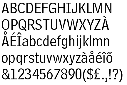
Sans-serif typefaces became common in the twentieth century. Gill Sans, designed by Eric Gill in 1928, has humanist characteristics. Note the small, lilting counter in the letter a , and the calligraphic variations in line weight.
ex. Century Gothic, Fette Fraktur, Swiss 721

Script
Script typefaces often mimic handwriting techniques
ex. Mama script, Suave Script, Mousse script

Blackletter
Legacy German text typefaces now used for display
ex. Kaas, Fakir, Brea

Grunge
Font that looks dirty or grungy
ex. Badhouse, New Global, Behind the Typedia Logo

Monospaced
All the font's characters have the same width

Friday, September 18, 2009

Representatives of Letterforms...

3. The Font Bureau, Inc.


Uniting two complementary professional backgrounds, publication designer Roger Black and type designer David Berlow founded The Font Bureau, Inc., in 1989. Drawing letteres by hand early in his career at the New York office of Linotype in 10978, Berlow's interest in and knack for digital typography grew when he joined Boston-based Bitstream in 1981 and adapted to the technologies of Adobe Postscript and, later, Apple's competing TrueType in the late 1980's.

Also taking advantage of the Macintosh was Black, a seasoned art director of magazines like Rolling Stone, New York, and Newsweek. He started his own business focusing on the design of newspapers and magazines in 1989, the same year he and Berlow establish Front Bureau. With Black embarking on numerous publication designs and Font Bureau creating proprietary type families, the foundry's output has ballooned to more than 1,500 typefaces that have their own flair.

Representatives of Letterforms...

2. Matthew Carter
Born 1937


Matthew Carter had much experience with metal type, phototype, and digital type. He has excelled in designing an array of typefaces in the various technologies; his classical, experimental, functional, and decorative typefaces and type families have influences designers around the world for over 40 years.
Carter freelanced for six years in London as a typemaker and a type designer. In 1965 he moved to New York as house designer for Mergenthaler Linotype, where he spent the next six years. Back in London in 1971, Carter continued freelancing for Linotype, producing several typefaces, uncluding the technologically creative Bell Centennial.

Carter with a few other men later established Bitstream, a digital type foundry in 1981 in Cambridge, MA. They enjoyed great success in the 1980's but with the growing company, Carter had very little time to design.

In 1991, Carter co-founded the Carter & Cone Type, Inc., where he has designed some of his most lauded typefaces, including Verdana.

Representatives of Letterforms...


1. ITC
Est. 1970 in New York, NY


-- ITC, The International Typefaces Corporation, founded by Herb Lubalin and Aaron Burns. It used phototypesetting instead of metal typesetting. This use of phototypesetting made it easier to develop, distribute, and reproduce typefaces. ITC also triggered a change in the way typefaces where distributed and how designers were remunerated. ITC provided the source material to reproduce their typefaces on any phototypesetting machine and paid designers a royalty based on the amount of orders of their designs. Unfortunately, the wide availability of the material increased the risk for piracy.

"ITC built a significantly large library of typefaces with contributions from designers like Ed Benuiat, Tom Carnase, and Tony DiSpigna..." They offered an "optimistic selection of display typefaces that were heavily and attractively marketed by ITC through its popluar U&lc publication, which showcased the library while providing unique and engaging content to the growing list of subscribers."

In 1999, Esselte closed ITC and sold the library and name to Agfa Monotype Imaging

http://www.itcfonts.com/

Friday, September 4, 2009

Who is Adrian Frutiger


"Adrian Frutiger is best known as a type-designer. He has produced some of the most well known and widely used typefaces. He was born in 1928 in Interlaken, Switzerland, and by the age of 16 was working as a printer’s apprentice near his home town. Following this he moved to Zurich where he studied at the Zurich School of Arts and Crafts, under Professor Walter Kach.

After his education in Zurich, Frutiger moved to Paris where he started to work at the Deberny & Peignot typefoundry. Here he helped the foundry move classic typefaces used with traditional printing methods to newer phototypesetting technologies.

At the same time Frutiger started to design his own typefaces, a few of which became very significant, and this earned him his status as a great type designer. Throughout his career he has produced a number of books, such as:


Type, Sign, Symbol (1980)
Signs and Symbols: Their Design and Meaning (1989)
The International Type Book (1990)
Geometry of Feelings (1998)
The Development of Western Type Carved in Wood Plates (1999)
Forms and Counterforms (1999)
Life Cycle (1999)
The Univers (1999)
Symbols and Signs: Explorations (1999)"


http://typophile.com/node/12118

"Why is Univers unique?"

Univers is unique because:

"Different weights and variations within the type family are designated by the use of numbers rather than names, a system since adopted by Frutiger for other type designs. Frutiger envisioned a large family with multiple widths and weights that maintained a unified design idiom. However, the actual typeface names within Univers family include both number and letter suffixes.

Currently, Univers type family consists of 44 faces, with 16 uniquely numbered weight, width, position combinations. 20 fonts have oblique positions. 8 fonts support Central European character set. 8 support Cyrillic character set."


http://en.wikipedia.org/wiki/Univers


Who is John Baskerville?


"Baskerville, John 1706–75, English designer of type and printer. He and Caslon were the two great type designers of the 18th cent. in England. He began his work as printer and publisher in 1757 and in 1758 became printer to the Univ. of Cambridge. Baskerville's first volume was a quarto edition of Vergil. His type faces introduced the modern, pseudoclassical style, with level serifs and with emphasis on the contrast of light and heavy lines. This style influenced that of the Didot family in France and that of Bodoni in Italy. Books printed by Baskerville are typically large, with wide margins, made with excellent paper and ink. His masterpiece was a folio Bible, published in 1763. After his death his wife operated the press until 1777. Then most of his types were purchased by Beaumarchais and were used in his 70-volume edition of Voltaire. The matrices, long lost, were rediscovered and in 1953 were presented to Cambridge Univ. Press. Among Baskerville's publications in the British Museum are Aesop's Fables (1761), the Bible (1763), and the works of Horace (1770)."

His work in England was not as admired as it was in the United States.It was greatly admired by Benjamin Franklin. His fonts were brought to the United States of America by Benjamin Franklin, who was a member with him in the Royal Society of Arts, where they were for many of the federal government publishing.
Baskerville is unique in the
sense that is was not widely accredited by many in
Britain especially by competitors. But now, Baskerville's
types are used widely throughout many states and countries.


FOR MORE INFORMATION: http://www.infoplease.com/ce6/people/A0806405.html


Tuesday, September 1, 2009

Responding to the Visual Concepts Article

After finally reading this document all of the way through, I have come to the conclusion that graphic design is more than what I thought it was. For the public, graphic design might seem an easy job to do, but with the more information I have about graphic design and the ideas behind it, I can tell it is more than just an easy job.

Graphic design deals not only with symbols, but it also deals with icons, index, and other forms of communication. And with all of these different ways of interpreting a design, the viewer can get different ways of interpreting the design. Communication is crucial to graphic design. If the design does not convey a message to the public, then it has not done its job. The most important job a designer needs to do is to communicate with their viewers. This can be done is many different creative ways, but when it comes down to the basics, it has to deal with communicating the bigger idea behind the design. Noise is something that could interfere with this communication process, but with clear and decipherable ideas, the designer should be able to get the point across.

I have learned that I have a lot more learning about graphic design and I am excited to take on this journey through the next three years and the years to come after.